


2025 Interior Design Trend Predictions
A new year brings new interior design trends! In 2024 we saw minimalism, art deco style designs and Peach Fuzz named the colour of the year. But what does 2025 hold for the interior design world? Take a look at what we think is predicted to be a big interior design trend in 2025.
Curved Furniture
Curves were predicted to be a big trend in 2023 but rounded furniture in particular, will continue to be a big trend into 2025. Curves can add a stylish and elegant touch, giving homes a more fluid and organic aesthetic. Watch out for furniture and architectural elements such as curved sofas, mirrors, kitchen cabinets and arched doorways.
How can you incorporate it into your home? For small subtle changes, swap out coffee tables and mirrors for circular versions. If you want to make a statement, consider adding an arched doorway to your home. Or why not add a curved island to your kitchen? An island is a great way to create an inviting environment for people to converse in a relaxed and modern setting.
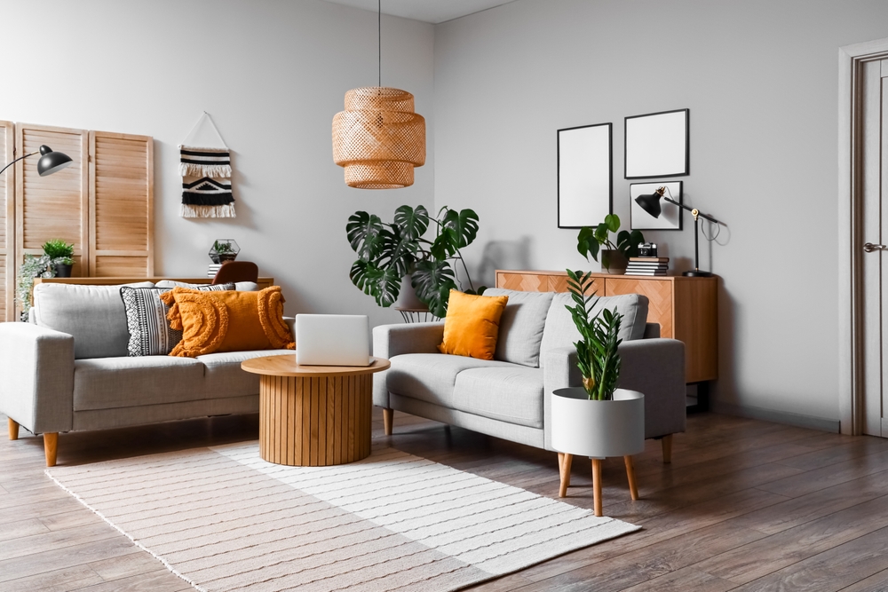
Multifunctional Spaces
Gone are the days where a room can only serve one purpose. With hybrid jobs here to stay, there is less need for just a living space and more need for rooms with more than one single purpose. The need for flexibility in an ever-changing world matters and can be achieved effortlessly.
Multifunctional space ideas:
- Zone areas in a room. Use furniture like a bookshelf to help create different zones in a room. This will allow you to separate work and dining for example even if you are doing both in the same room.
- Use wall art to determine where one area starts and another finishes. You can use different types of picture frames for different areas. For example, you can use black picture frames in your office area and coloured picture frames in your room’s living area to help differentiate.
- Create flexible workspaces with smart storage solutions. Utilise fold-way shelves and cabinets to pack away your work essentials when you have signed off for the day. You can also use rollable storage carts to immerse yourself in different functional spaces.
Colour Drenching
Colour drenching is when one colour is used to paint/cover multiple things in a room. For example painting your walls, ceiling and door all in the same colour. We predict more people will colour-drench their rooms rather than have feature walls in 2025. Colour drenching is a great way to add drama and a cosy vibe to a room. Some people will decide to use different shades of the same colour to keep a room from being too stagnant. Watch out for rooms like living rooms being colour-drenched in 2025!
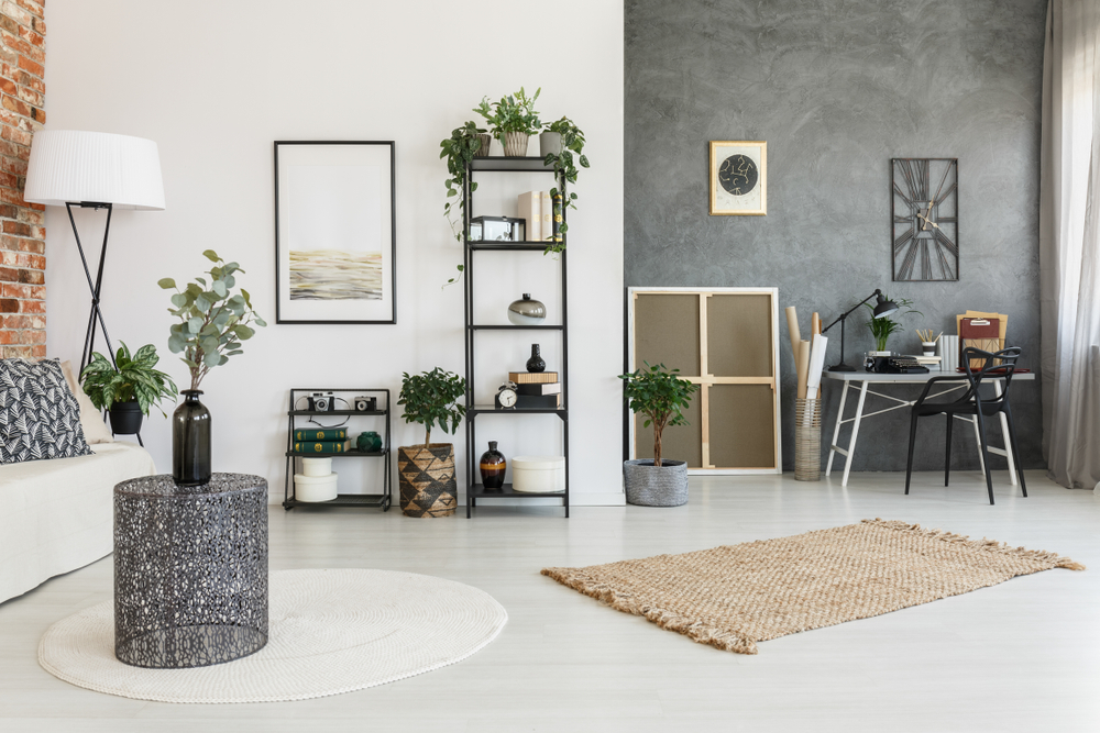
Maximalism
In 2025 more is more!
Minimalism has been dominating interior design trends for many years now but it looks like maximalism will make a big comeback in 2025! Maximalism embraces different patterns, textures, and colours all working together in one room. You can do almost anything with maximalism. Make the most of playful contrasts with things like modern furniture being paired with antique statement pieces. This trend is a great way to fill a room with all the things you love and reflect your unique personality.
A gallery wall is a great way to add a maximalist touch to your home interior. To create an impact use a range of picture frame sizes and styles including bold coloured picture frames, gold picture frames and white picture frames.
Pantone’s 2025 Colour Of The Year
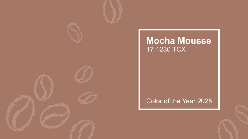
This year we see ‘Mocha Mousse’ as Pantone’s colour of the year. Mocha Mousse is described as a colour to empower you and helps create a luxurious setting. It has the qualities of chocolate and coffee, suggesting a feeling of comfort, indulgence and contentment. This versatile warm brown colour can be added in many subtle ways in your home whether that be through furniture or framed art prints. We expect many home interiors to feature this colour in 2025. Will you be adding a touch of Mocha Mousse to your home?
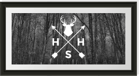
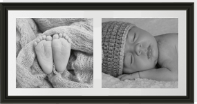
Updating Your Interior Design With Picture Frames
Picture frames are a great way to add some personality to your home. You can frame almost anything in a picture frame including photos, photography, artworks, keepsakes, pressed flowers and even puzzles.
Browse our wide range of frames to add a personal touch to your interior design in 2025.

