





How to style gold framed picture frames in a modern living room
Article Overview
Decorating a contemporary home often feels like a balancing act between achieving a clean aesthetic and ensuring your space still feels welcoming and personal. Many homeowners struggle with the fear that traditional metallic accents might look dated or clash with their existing minimalist furniture, which leads them to settle for safe but uninspiring choices. This guide helps you understand why gold frames provide the perfect bridge between classic elegance and modern living room decor, helping you to create a curated look that feels intentional and warm. By mastering the placement and scale of these pieces, you transform your walls into a gallery that speaks to your personality while maintaining that sleek, professional finish. We will walk you through the practical steps to select the right shades of metal so that your artwork enhances the room rather than fading into the background.
Choosing the right wall art often stops at the canvas or print, leaving the final presentation as an afterthought that undermines the entire room design. When you pick a frame that fails to complement the metallic tones or the colour palette of your space, the visual flow of your home suffers. This oversight makes a space feel fragmented or unfinished because the details are not aligned with your modern aesthetic goals.
Neglecting these small elements means you miss the opportunity to elevate a simple room into a high-end environment that feels truly sophisticated. Guests often notice when a frame looks mismatched or mass-produced, which can dampen the overall impact of your carefully selected furniture and lighting fixtures. When you fail to bridge the gap between your artwork and the room, you lose the chance to make your home feel like a cohesive, thoughtful sanctuary.
The best approach focuses on how gold frames interact with light and texture to define your modern living room decor. By selecting frames with refined lines and matte finishes, you bring warmth into a neutral space without creating an overly ornate or heavy appearance. This guide shows you how to curate your walls with confidence so that every piece of art serves as a functional part of your home design.
Key Takeaways
– Metallic tones add a layer of warmth to minimalist spaces because they catch the natural light and provide a subtle contrast against white or grey walls.
– Matte or brushed finishes work best in contemporary settings as they offer a sophisticated sheen that avoids the distracting glare of high-gloss gold surfaces.
– Repeating the gold element across different items like table lamps or scatter cushion zips creates a sense of unity which ties your entire living room together.
Need Specialist Advice on Gold Framed Picture Frames?
Speak to our technical team today for tailored specifications, regulations compliance, and practical support.
How to choose the right shade of gold
When you hold a frame sample against your wall, you might notice how the ambient light in a British living room shifts throughout the afternoon. Many of our customers discover that a frame which looks brilliant on a screen can behave quite differently when it sits on a bookshelf or hangs above a radiator. The metallic quality of a finish interacts with the shadows and the existing light fittings, which means you should test your options under the specific conditions of your own home before you finalise your order.
Why warm tones work in darker rooms
If your space faces north or feels a bit dim during the winter months, you might want to lean into the richness of deep, burnished gold. These shades bring a sense of warmth to the room, especially when the evening sun has long since faded and you have switched on your lamps. Because the light is softer, a high-shine frame can occasionally feel a little too stark, so a matte or brushed effect often creates a more comfortable and inviting atmosphere for your guests.
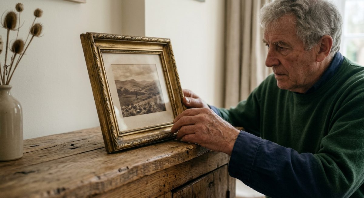
- Antique gold offers a subtle, weathered appearance that pairs beautifully with historical art or vintage photography.
- Champagne gold sits somewhere between silver and traditional gold, which makes it a versatile choice for modern, neutral interiors.
- Bright, polished gold adds a touch of glamour that draws the eye directly toward the photograph, which works well if you want a bold focal point.
Assessing the cool side of gold
When you look at rooms with a lot of natural light or white walls, you might find that cooler, paler golds provide a cleaner finish. These options avoid the risk of looking too yellow, which can sometimes clash with contemporary furniture or grey decor. Many people find that custom picture frames in a paler, lighter gold blend in without dominating the artwork, particularly if the wall colour has subtle blue or green undertones.
Because our local clients often have varied tastes, it is always a sensible idea to observe how different metallics reflect the colours of your furniture. If you have plenty of natural timber, a warmer gold will pick up the orange hues in the wood, while a cooler gold will sit back and let the texture of the grain take centre stage. Once you have a clear picture of how these tones behave in your house, you can pick a finish that complements your style rather than fighting against it. It is usually the small details that make a room feel complete, so trust your instincts when you see how a piece looks in the quiet light of early morning.
| Finish Type | Best Aesthetic | Maintenance Level | Room Suitability |
|---|---|---|---|
| Polished Brass | Glamorous and formal | Requires frequent dusting | Formal living rooms |
| Brushed Gold | Understated modern | Low maintenance | Contemporary family spaces |
| Antique Gilt | Eclectic or period | Moderate dusting only | Character properties |
Where to position your framed artwork
The best heights for your home gallery
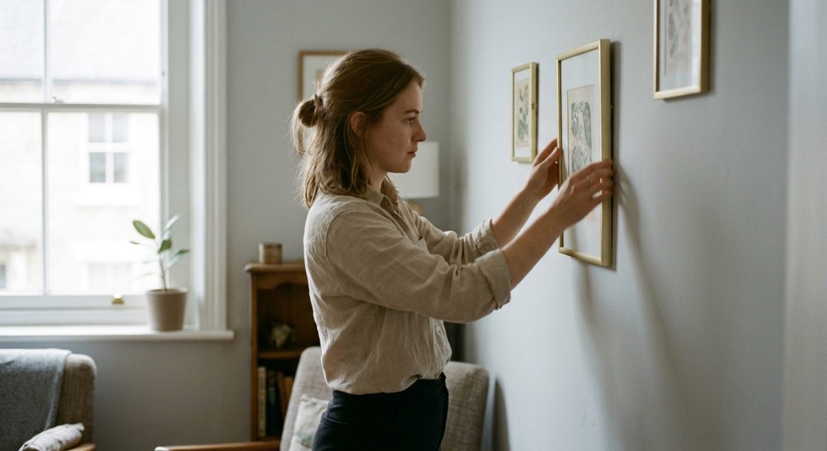
When you hang your favourite pieces, the biggest mistake is often positioning them too high for the average person to enjoy properly. You should aim to place the centre of your frame at approximately eye level, which is usually around 145 centimetres from the floor for most people. If you find yourself in a room with particularly high ceilings, you might feel tempted to lift the art further up the wall, but this often creates a disconnect between your furniture and your decor. Think about how a local interior designer might treat the space, where they typically anchor artwork just above a sofa or console table so that the connection between the piece and the room feels intentional and cosy.
Balance and light in modern spaces
Gold frames add a lovely warmth to a room, especially when they catch the natural light coming through a window during a bright afternoon. You should observe how the sunlight hits your walls throughout the day because metallic finishes reflect light and can create distracting glare if placed directly opposite a south-facing window. A clever trick is to place your gold frames in slightly more shaded areas or near a soft lamp so that the finish glows gently without overwhelming the eye. This approach is similar to how you would choose the right monitor brightness for your home office, where managing light levels makes everything much easier on your eyes.
Create a flow across your walls
Once you have a general idea of the heights and lighting, consider how you might group your items together as part of your overall design. You could try arranging your framed photos as gallery walls, which helps you combine smaller memories into one cohesive unit that feels like a deliberate design choice. If you prefer a cleaner look, you might select one or two large statement pieces to act as the primary focus of your living area. These larger frames need a bit of breathing room so that they do not feel cramped by surrounding bookshelves or tall plants. When you step back to assess the arrangement, look for gaps that feel a bit empty and see if a simple shift of an inch or two provides the balance your eye needs to settle. Many of our customers tell us that spending ten minutes moving their frames around until the gaps feel even is the most effective way to elevate the professional look of their home decor. Taking this extra time means you end up with a wall that feels curated rather than cluttered, which makes the whole living room feel finished and calm.

Ways to pair gold frames with mount boards
Why the right colour creates balance
When you look closely at how a gold frame sits against a wall, you might notice that the transition between the artwork and the metallic edge often feels a bit harsh without a buffer. In practice, this means you should consider your mount board colours as a clever way to soften the intensity of the gold while drawing the eye toward the centre of the image. A crisp, off-white mount creates a traditional gallery aesthetic that works perfectly in most living rooms because it lets the frame act as a subtle highlight rather than an overwhelming focal point. If your room features darker furniture or moody wall colours, a charcoal mount can make the gold finish appear significantly more sophisticated and deliberate.
Selecting the perfect combination for your space
Because local customers tend to have specific tastes based on their home architecture, we often suggest testing a few samples before making a final commitment to your custom order. Once you have a clear picture of how the light hits your walls during the evening hours, you can choose a mount that complements the undertones in the surrounding decor. These combinations work well for most interiors.
1. A classic white mount board keeps the look airy and bright, which helps if your gold frame has an ornate or heavy profile.
2. An ivory or cream mount provides a warmer, softer connection to a brushed gold frame, which is ideal for period properties with traditional wooden features.
3. A deep navy or forest green mount creates a dramatic, high-contrast effect that makes the gold elements pop in a modern, minimalist living room setting.
Technical considerations for a polished finish
As professional picture framing experts, we have seen how the depth of the mount can change the way the entire piece hangs on the wall. A slightly thicker or double-layered mount adds a sense of dimension that makes the gold frame look intentional and professional, so that your walls feel like a curated exhibit. This attention to detail shows when you place your finished piece near a piece of modern art or a family photograph, because the mount helps protect the image from touching the glass while anchoring the composition. If you feel unsure about which thickness or tone will look best, checking how your chosen frame style loads on our website is a great way to visualise the proportions before you place your order. Whether you prefer a bold contrast or a soft, monochromatic blend, the interaction between your chosen mount and the gold finish is what turns a simple frame into a permanent part of your home decor.
How to maintain your custom gold frames
A gentle touch for your finish
When you look closely at those shimmering gold edges, you will notice that dust tends to settle on the ornate profiles of made to measure frames rather quickly. Because the finish can be delicate, you should always avoid using harsh chemical sprays or abrasive kitchen cloths that might scratch the metallic surface. In practice, this means reaching for a soft, dry microfibre cloth to gently lift away debris once a fortnight, which helps keep the lustre looking sharp and vibrant against your walls. If you find a stubborn fingerprint on the metallic leaf, dampen a corner of your cloth with the tiniest amount of distilled water, though you must ensure the wood remains completely dry afterwards to protect the integrity of the joins.
Protecting the integrity of the frame
Because local customers often ask about the longevity of their display, it is worth remembering that gold finishes are sensitive to both direct sunlight and fluctuating humidity levels. If you place your picture in a sunny spot near a window, the UV light might cause the colour to mellow over many years, so it is worth rotating your artwork or adding a UV-resistant glass layer to the interior. You might check how your frame reacts to the changing seasons by watching for any tiny gaps that appear in the corners, which sometimes happen when the central heating kicks in during a cold snap. Dealing with this is quite simple because you can often adjust the tension of the backing pins to ensure the frame keeps a snug grip on your image throughout the entire year.
Keeping your glass clear and bright
Once you have a clear picture of how to handle the exterior, you should turn your attention to the glazing to keep the room feeling bright and airy. It is tempting to scrub at the glass, but the secret is to spray your chosen cleaner directly onto your cloth instead of the frame itself, which prevents liquid from seeping behind the edges and staining the internal mounting board. By moving the cloth in slow circular motions, you remove those unsightly smudges without leaving behind streaky marks that catch the light at awkward angles. Because this simple habit takes less than a minute, it makes your custom gold frames look brand new without any heavy lifting or expensive professional services. Following these few steps creates a calm and polished environment for your home, so that your favourite memories stay the centrepiece of your living room for many decades to come.
Frequently Asked Questions around Gold Framed Picture Frames
Will gold frames look too traditional in a contemporary space?
Modern interiors often feel a bit stark, so adding a metallic touch creates an immediate sense of warmth which bridges the gap between minimalist lines and comfort. You should choose thin, streamlined profiles because they avoid that ornate Victorian feel, allowing the gold to look like a clean, intentional design choice rather than an antique remnant.
How do I mix gold frames with existing black or white furniture?
Contrasting colours are excellent for visual depth, especially when you treat gold as a metallic accent that pulls everything together in a room full of neutral tones. You can place a gold frame on a black shelf to make the art pop, which helps the metallic finish feel grounded and sophisticated against the darker matte surfaces.
Is it necessary to match the gold tone with my light fittings?
You can mix brass, champagne, and bright polished gold tones because a layered look often appears more collected and authentic than a perfectly matched showroom set. Variety in your metallic finishes adds character to the living room, so do not worry if your curtain poles or lamps possess a slightly different sheen compared to the frames.
What should I look for when buying budget-friendly gold frames?
You might find some high-street options that use a high-quality foil wrap, which gives the appearance of solid metal without the heavy price tag of 200 pounds. Inspect the corners for clean, tight joints because a poorly finished corner is where cheaper frames usually give themselves away, so focus your search on styles with crisp, simple edges.
Where should I position these frames to get the best light?
Natural light hitting a metallic finish creates a lovely glow, so try to hang your pieces where they catch the sunshine during the mid-afternoon hours. Avoid direct glare that makes it difficult to see the artwork inside, which means you should experiment with the placement to ensure the reflections enhance the piece instead of obscuring it.
Do I need to use gold frames for every single picture on a gallery wall?
Variety is the spice of life, so you can definitely mix your gold frames with wooden or black options to create a more relaxed and eclectic display. This approach prevents the wall from feeling like a catalogue layout, which means your personal collection of prints and photographs will feel much more natural and truly yours.
How do I keep the frames looking clean and bright?
Metallic finishes can collect dust and fingerprints quite easily, so you should wipe them gently with a soft microfibre cloth once a fortnight to maintain their shine. Never use harsh chemical cleaners because these can strip the finish away, so stick to a dry cloth or perhaps a tiny drop of water if you find stubborn marks.
Should I choose a mount for my art inside a gold frame?
A crisp white mount creates a beautiful border that protects the artwork while providing a sense of space that lets the gold frame sit comfortably against the wall. You will find that this professional touch elevates even a simple print, which makes the whole composition feel finished, polished, and ready for your next dinner party.
Ready to Discuss Your Gold Picture Frames?
Get in touch with our specialists today for detailed site guidance, technical specifications, and a quotation tailored to your requirements.

